Designing SVB’s lending experience
Four projects and a bank collapse later: my journey at Silicon Valley Bank.
With the bank’s decision to invest in digital transformation, came the formation of multiple teams all focused on leveraging technology to improve the overall experience at SVB. During my 4 years at the bank, I worked on two teams that oversaw the entire client-facing lending experience, and part of the internal banker experience.
💡 Foundational context (company, team, project, product)
Operating in a large, regulated, financial institution adds significant design constraints due to:
- Reliance on external software vendors that, although allow teams to get started quickly, make it costly to implement anything that deviates from out-of-the-box features (i.e. optimizing for the short term over the long term).
- The sheer amount of reviews and assessments that the project must go through from inception to launch (i.e. security risk assessments, compliance reviews, legal reviews, etc.)
As a result of the above constraints, pursuing highly polished experiences becomes impractical — as a result, teams lean heavily on MVPs.
Applicant experience: phase 1
One of the first projects I worked on was designing the bank’s first digital loan application experience. The business case for pursuing this was to:
- Reduce cost and inefficiency of manual back and forth emails between borrowers and lenders
- Eliminate the task of lenders needing to manually enter submitted loan applications into downstream systems
- Automate the tracking of loan application submission timestamps to ensure compliance with Regulation B of the Equal Credit Opportunity Act (ECOA)
- Unlock automations for portfolio management
Our goal: To make it as easy as possible for prospective borrowers to submit applications for debt, and for lenders to collect and review them.
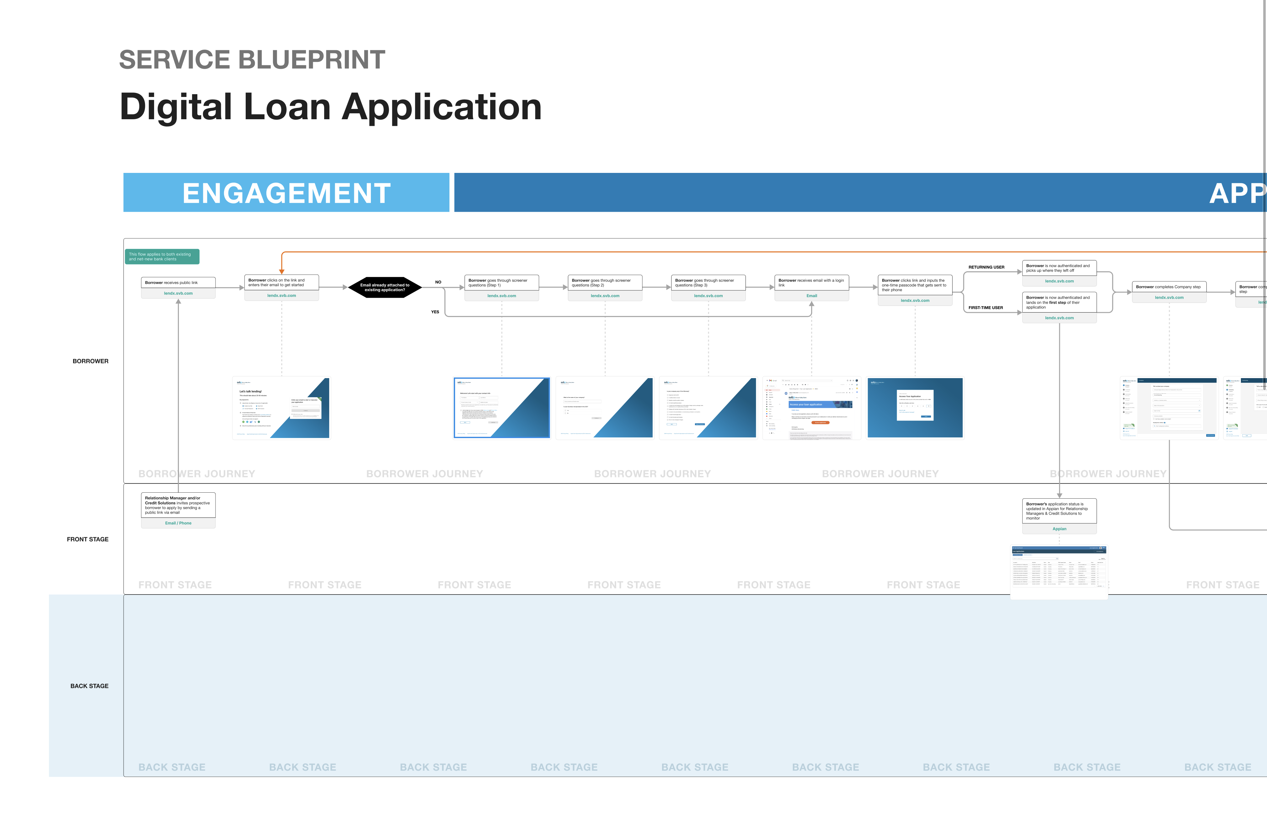
With our Product partners having already secured funding to build the first phase of the digital loan application (i.e. the initial application for debt), my starting point was to lead the creation of a Service Blueprint in collaboration with product, architecture, engineering, lenders, relationship managers, and business stakeholders.
💡 Optional tangent: my service blueprint learnings and best practices
Something I’ve learned about Service Blueprints is that most of the value is from the process as opposed to the artifact itself. The required collaboration provides a space for the team to efficiently (due to the low fidelity nature of blueprints) gain alignment on the journey fundamentals and avoid getting stuck in the weeds of interaction design. In my experience, once design has turned the journey into high fidelity screens, architecture has created their diagrams, and engineering has created their data flow diagrams, the blueprint becomes somewhat obsolete / referenced infrequently.
Best practices I’ve adopted over the years:
- Make it as easy as possible for participants to get on the same page at the beginning of each session (e.g. start with a recap and re-iterate pending questions, add supplementary visuals to speed up comprehension).
- As participants contribute, repeat back your understanding to maximize your, and the group’s, understanding and minimize costly misinterpretations.
- Avoid using swim lanes for individual roles; it makes it harder to read the blueprint when you have to scroll up and down excessively. Stick to the frontstage / backstage framework.
- Record sessions. Documenting and capturing nuance in real-time isn’t always practical, especially when multiple people are all engaging in the conversation.
- Have relevant opinions in your back pocket to stimulate conversation. It's often easier for participants to react to something when they aren’t the ones leading the session.
Takeaways that informed the design
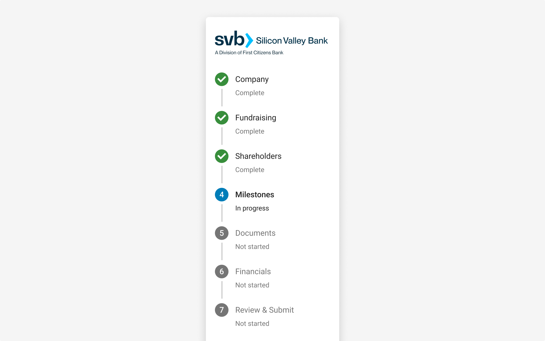
With the ease of applying for debt being a priority, I worked with lenders to carefully ensure that we’d only ask questions that are absolutely necessary for them to determine whether the applicant qualifies for a loan. We then grouped questions into logical sections to keep the borrower focused on one topic at a time, track their progress, and get a sense of what’s to come. We also placed the easiest questions upfront to give the borrower a sense of speed/progress as soon as possible, with more robust/complex questions towards the end:
We learned that the number, and substance, of questions lenders needed responses for was unrealistic to expect most borrowers to complete in a single session. As a result, we built the ability for borrowers to save their progress, which required us to design a solution for user authentication.
To save borrowers the hassle of setting and remembering a password for a loan application that could get denied, and because approved borrowers would be required to setup online banking credentials later in the process anyway, we opted for passwordless authentication via magic links:
We learned that all applicants are required to share their company financials, which often consists of multiple Excel files. So, to prevent the borrower from needing to manually compile and upload files, we give them the option to connect their accounting software through an API integration:
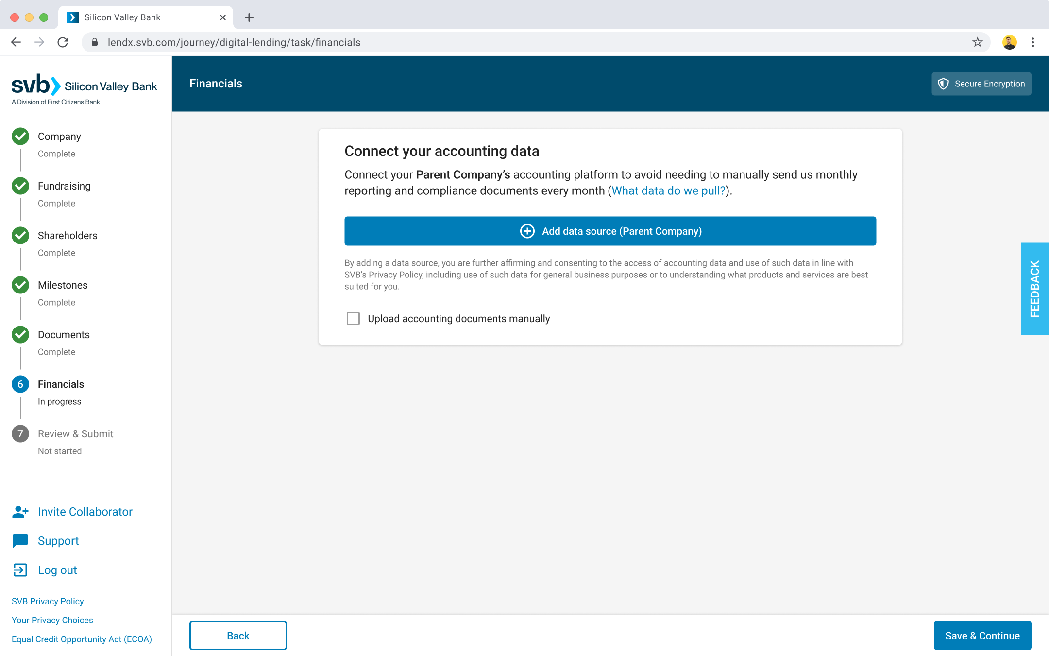
Once a borrower was approved, that same connection let the bank pull monthly financials without asking for the files again, and it led to an internal tool lenders used to review the portfolio.
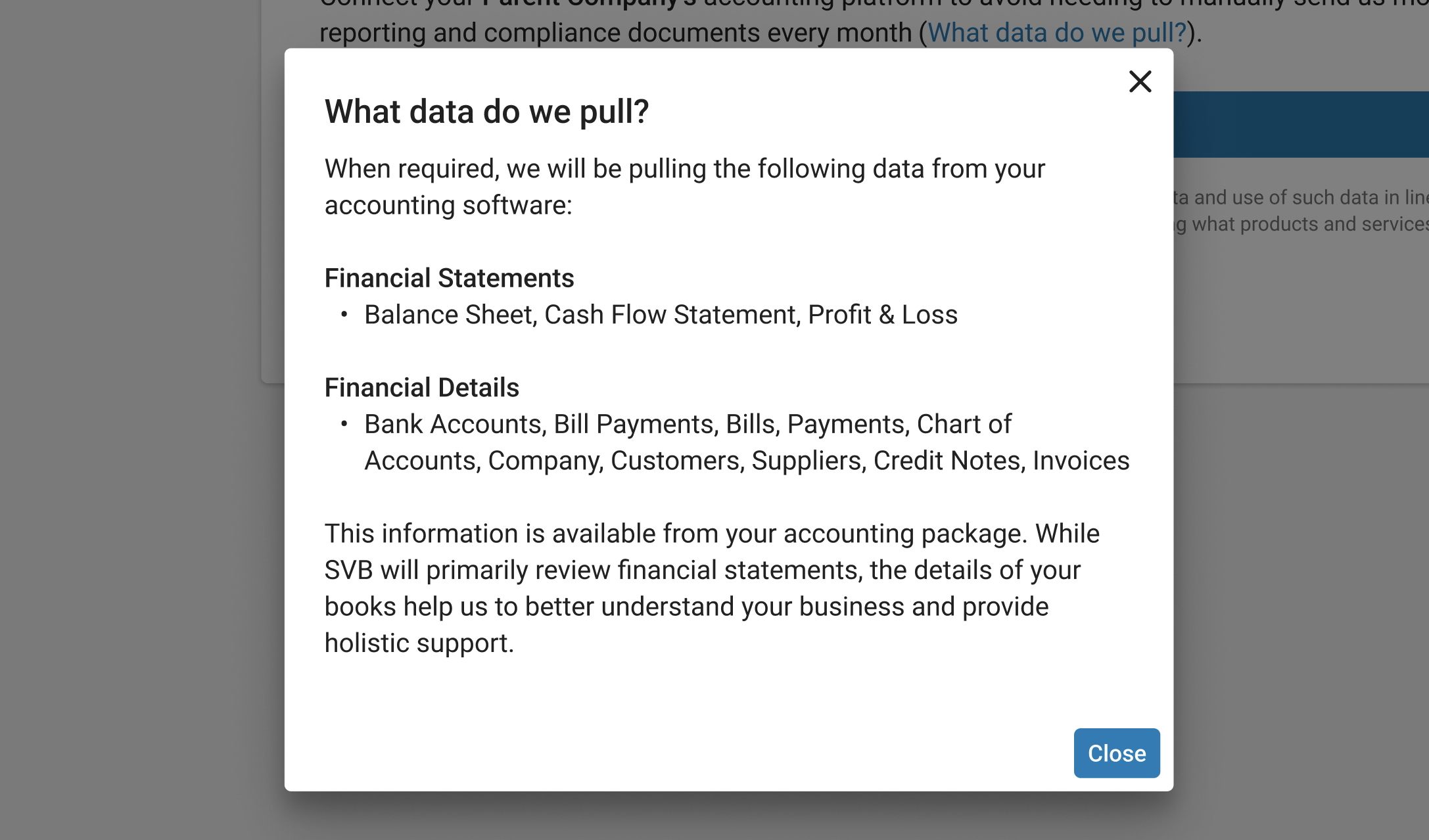
Related to the above, I figured it was safe to assume that some borrowers might be sensitive about connecting their accounting system to the bank’s. So we added content to be transparent in an attempt to alleviate some apprehension:
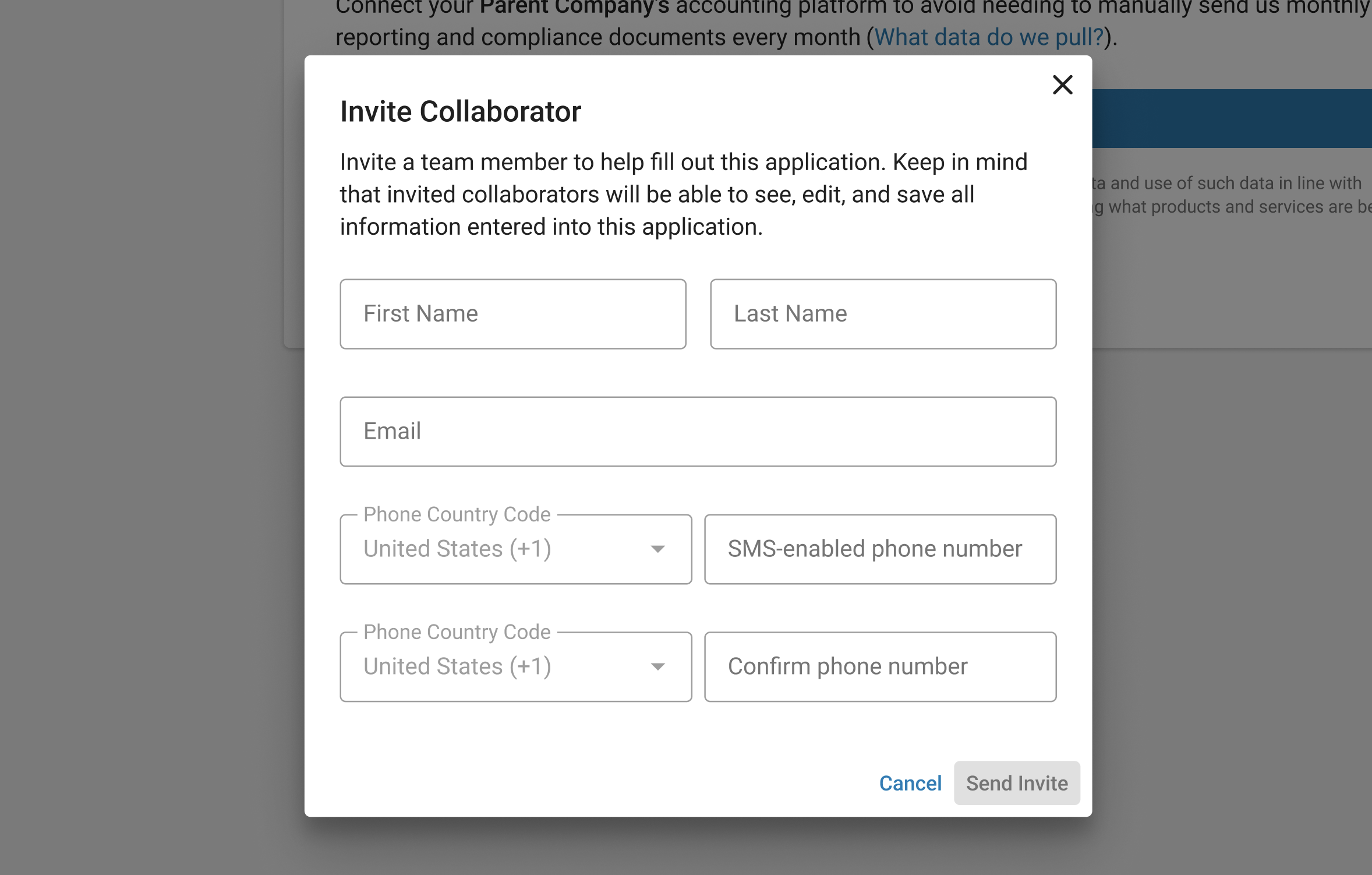
We learned that loan applications are often completed by more than one person at the applying company, so we added the ability for collaborators to be invited:
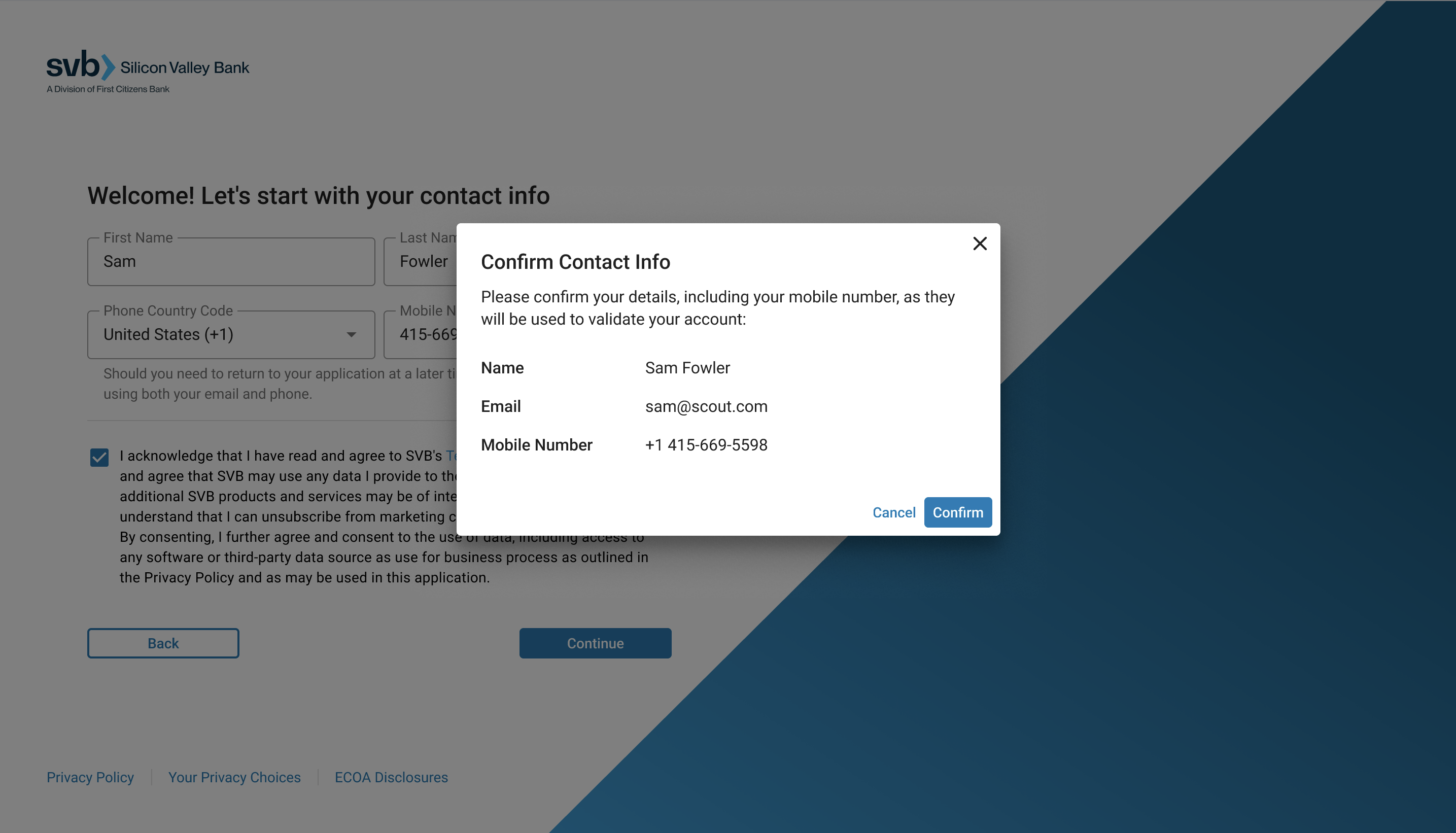
I learned from our developers that, at least for MVP, if the applicant entered their phone number incorrectly, it would be a tedious process for us to remediate. So, on our contact information step, I added a modal dialog box to reduce the likelihood of borrowers making this mistake:
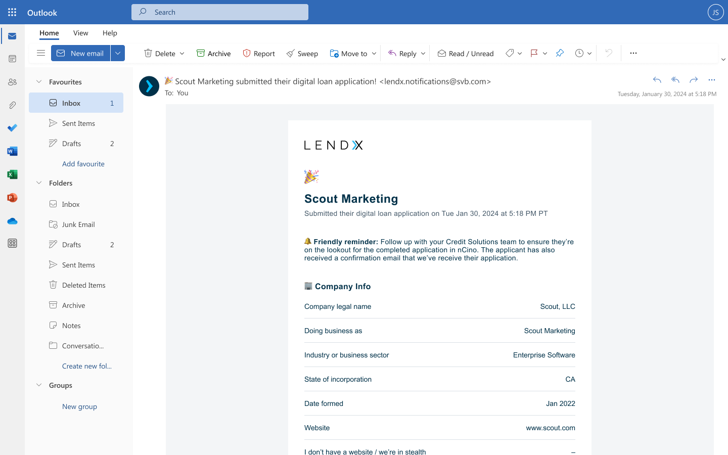
We learned that lenders wanted submitted loan applications to land in the internal underwriting tool they use most. However, relationship managers — who are also involved in the loan application process — don’t have access to that tool; nor did they want to be required to use a new tool in the first place (tool bloat was already an issue). As a result, we built an automated email notification to the relationship manager, which contained a copy of the submitted application to ensure they’re on the same page as the borrower:
Other decisions around visual design & content
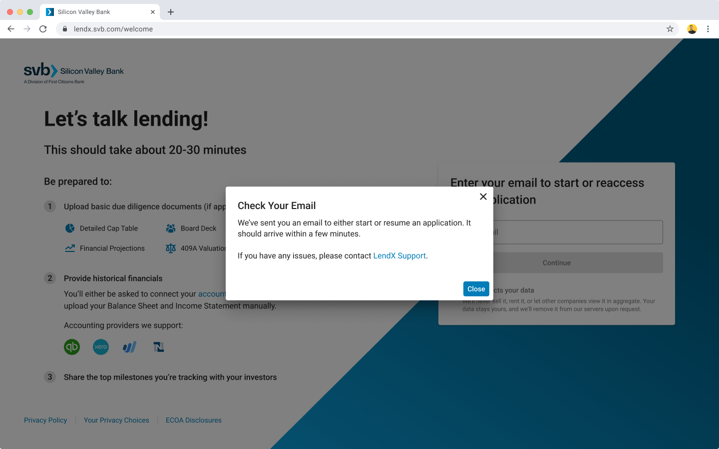
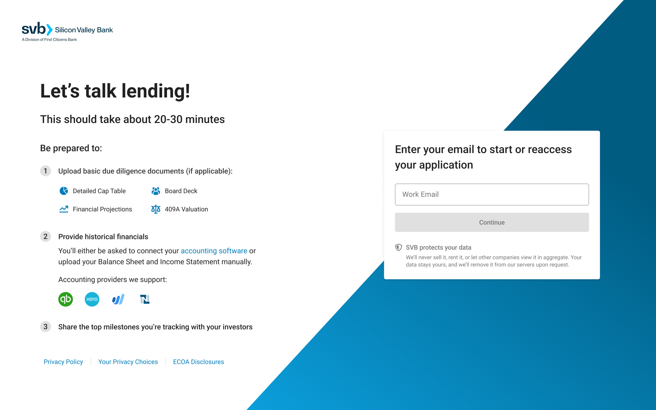
To increase the likelihood of the borrower being able to complete and submit their application in a single session, we added content to give them a heads up on what we’d be asking for:
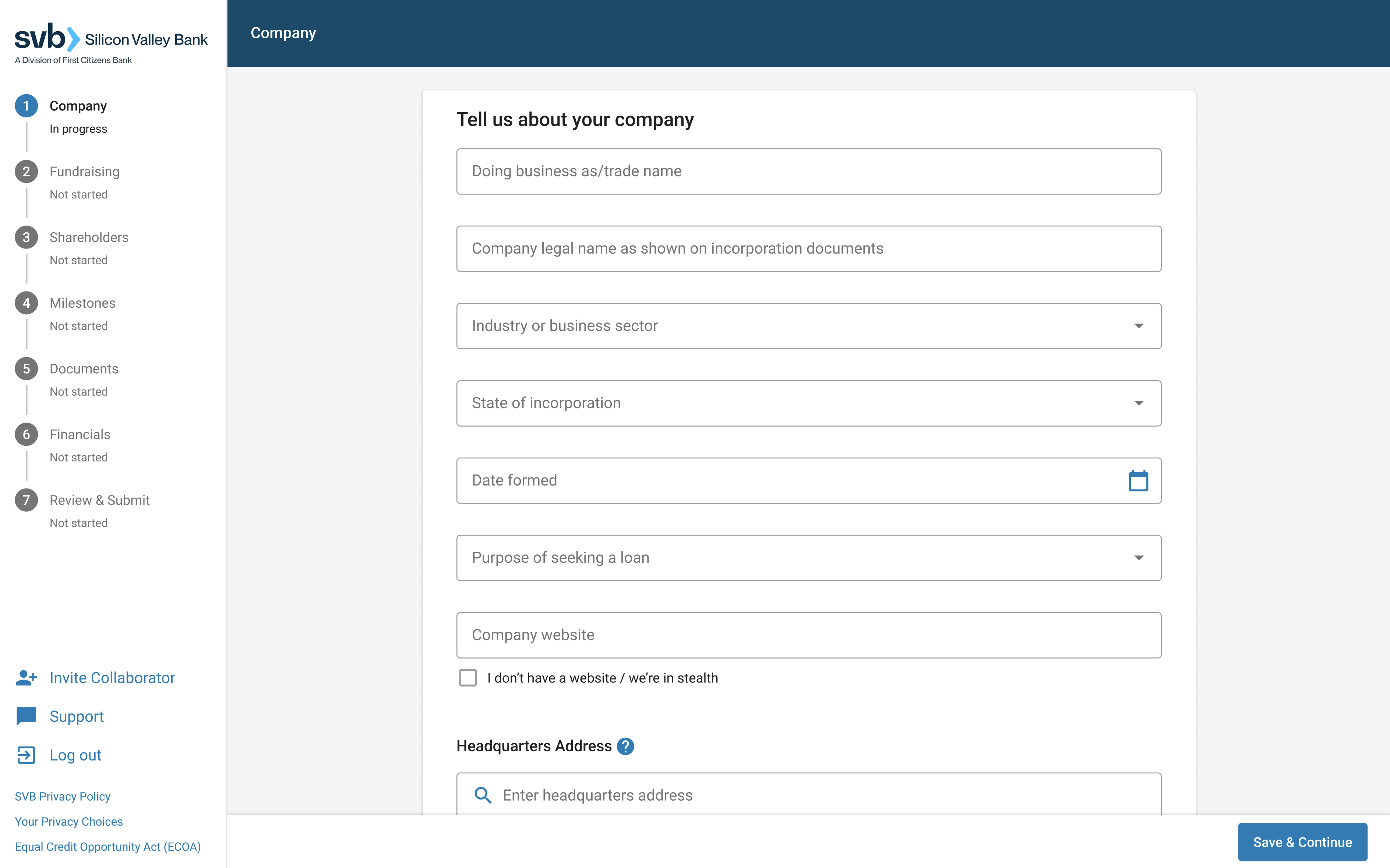
Since the bank already had a component library (based off Material UI), I didn’t need to start from scratch. I kept the progress stepper and controls all contained within the left rail, which freed up all vertical space to display the form (the user’s primary focus) and reduce the need for scrolling.
I also went with a single column for form fields to adhere to Luke Wroblewski’s and Baymard’s work and research on web form design:
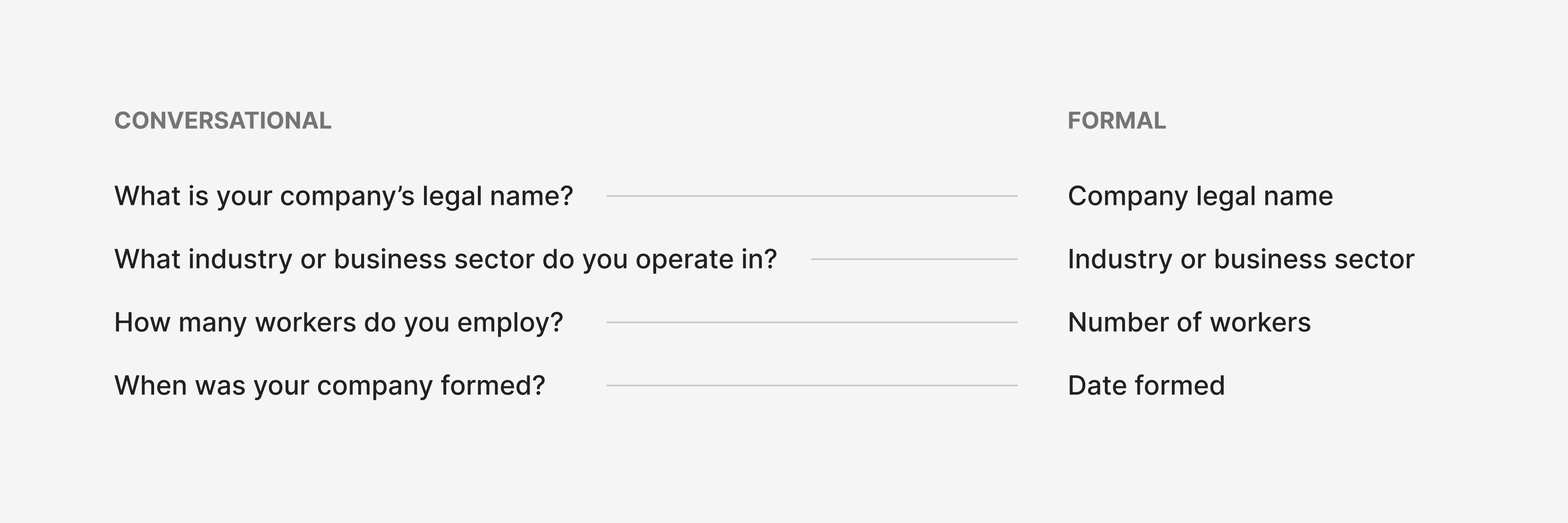
Again, wanting to borrow from Luke’s web form design research, I originally wanted to write our questions to use more of a conversational tone so as to create more of a natural dialog between borrowers and the form. However, with the bank already having well established brand guidelines for voice and tone, we had to go with a more formal voice and factual tone:
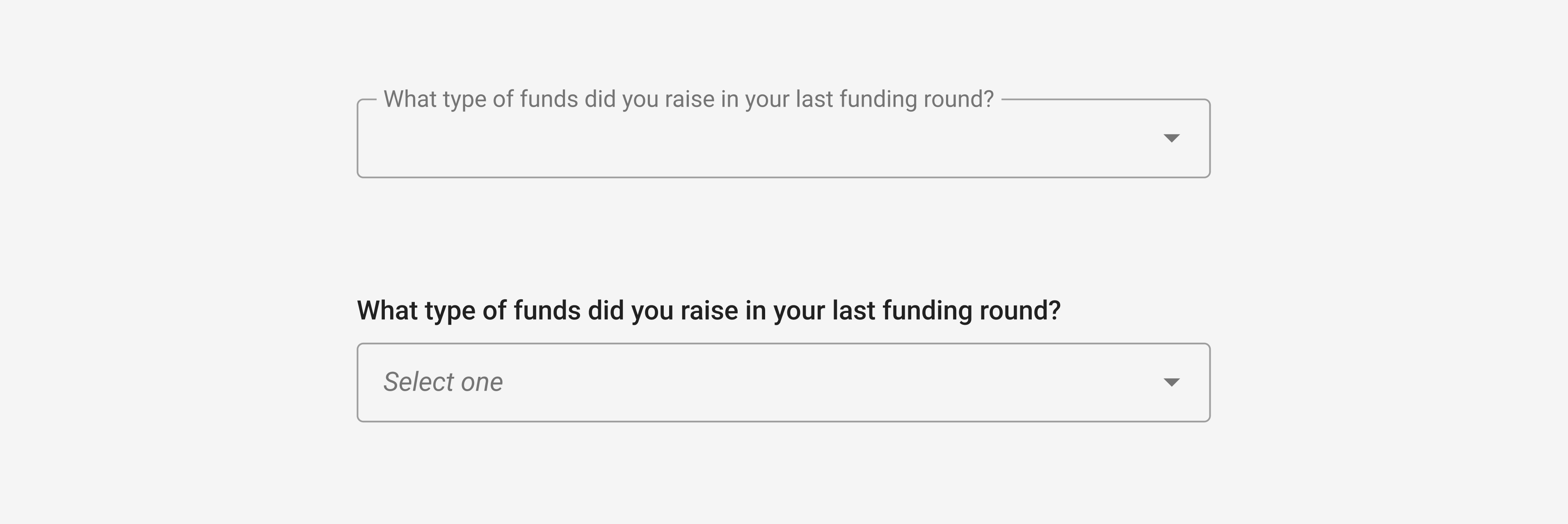
As an extension of the above, had we gone the conversational route, a variant of the input field I would have liked to introduce was one where field labels are displayed outside the field instead of floating along the top border:
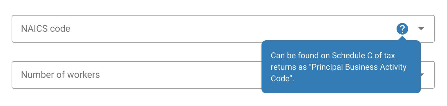
To assist borrowers in understanding specific questions, we added help text to areas where we predicted uncertainty:
Once again, borrowing from Baymard’s research on how users perceive security during checkout flows, I added a badge to enhance ‘visual security’:

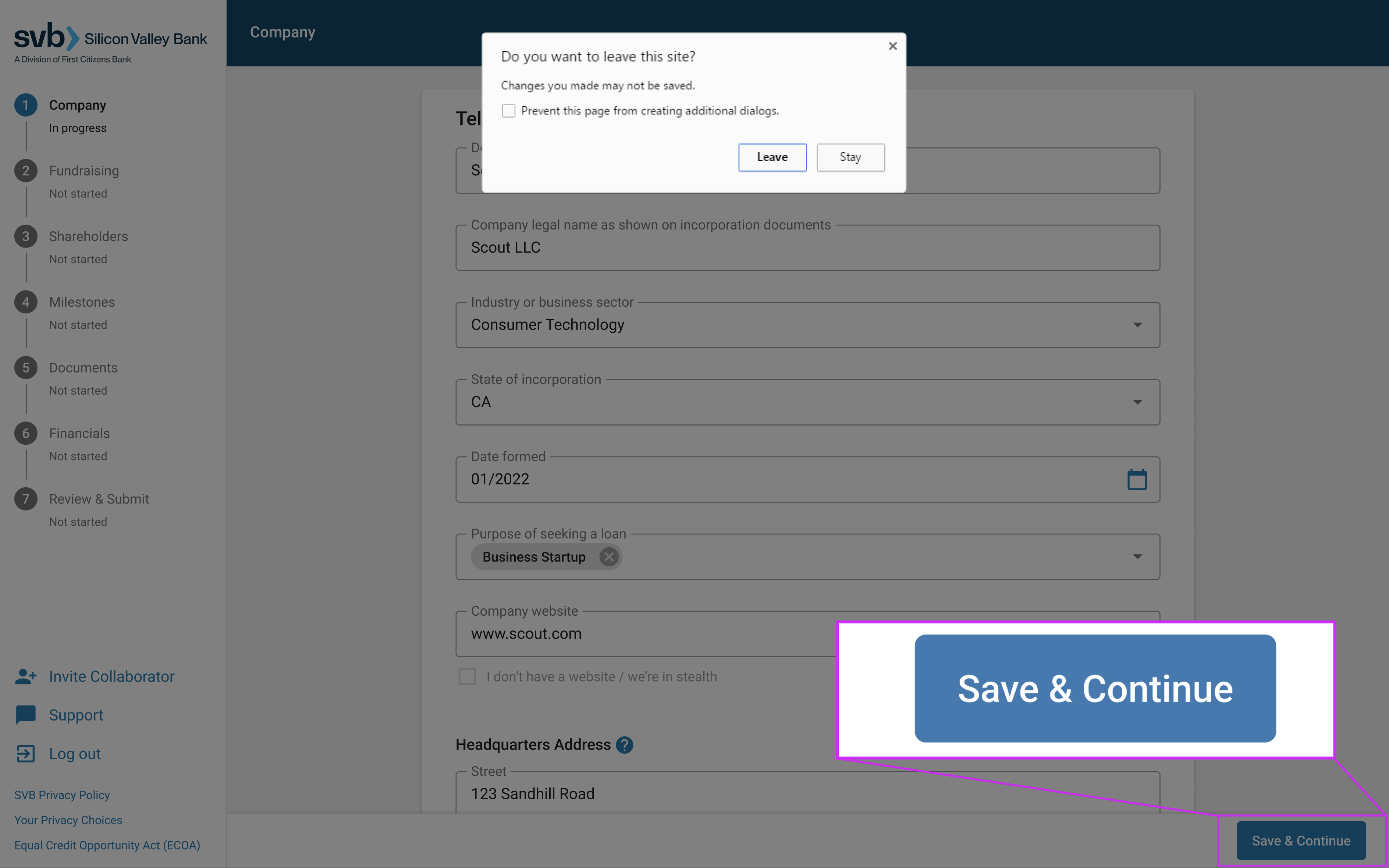
Due to a backend framework constraint, we couldn’t save borrower progress in real-time. They had to proceed to the next step in order to do so. I wondered if we could trigger some sort of warning if the borrower attempted to close their browser tab without saving, and after some research, discovered that we could leverage the JavaScript event listener “beforeUnload” to trigger a warning dialog that comes native to most browsers:
Post-launch improvements
We were hoping to speak to borrowers shortly after they submitted their application. This was around the time the bank collapsed, and we were not able to reach clients. I relied on CSAT feedback, Quantum Metric recordings, and anecdotes from lenders and relationship managers:
Observation: Roughly 50% of borrowers were choosing to provide their financial data by manually uploading their documents.
Hypothesis: After speaking with our lenders, we learned that borrowers weren’t necessarily uncomfortable sharing their data via API, it was that they wanted to wait until finding out if they even qualified for a term sheet first.
Another learning we did not consider: borrowers don’t necessarily have their books closed on time every month, but they assume we’ll pull their data regardless. This makes them anxious because they don’t want the bank making decisions about their credit with financial data that is not up to date.
Potential solutions:
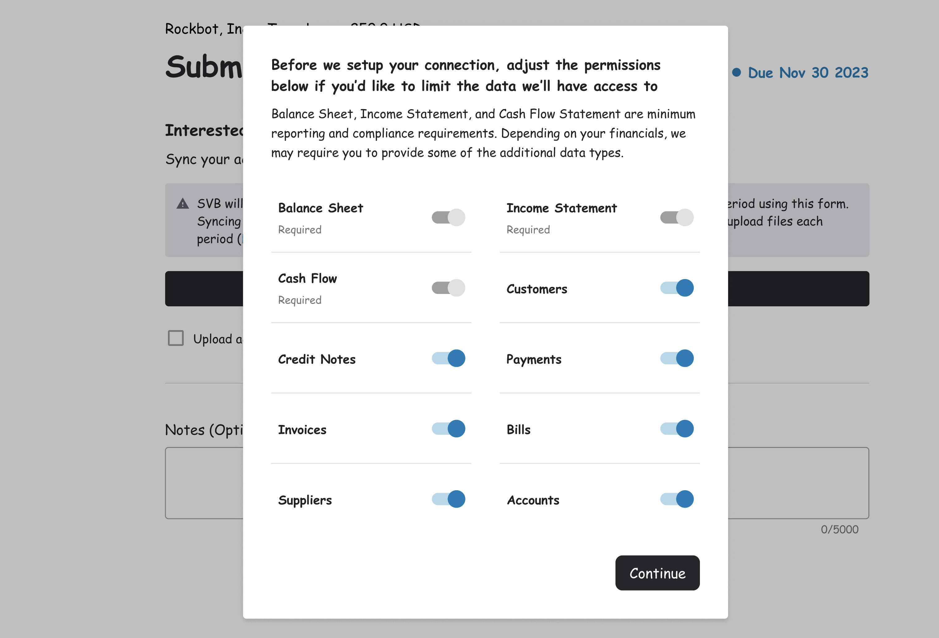
- Provide borrowers with the option to decide how much of their accounting package data to share (other than the bare minimum required):
- Provide borrowers with the option to explicitly grant SVB permission to pull their financials each month through the API connection, instead of just pulling it automatically:

Observation: Borrowers were attempting to navigate to subsequent steps by clicking on labels in the progress stepper.
Hypothesis: As mentioned earlier, since we were unable to save borrower progress in real-time, they had to proceed to the next step to do so. However, since all fields were required, they had to complete all fields before being able to proceed.
As a result, borrowers would partially complete a step, attempt to jump to the next step, only to be shown “Required field” error messages.
Potential solutions:
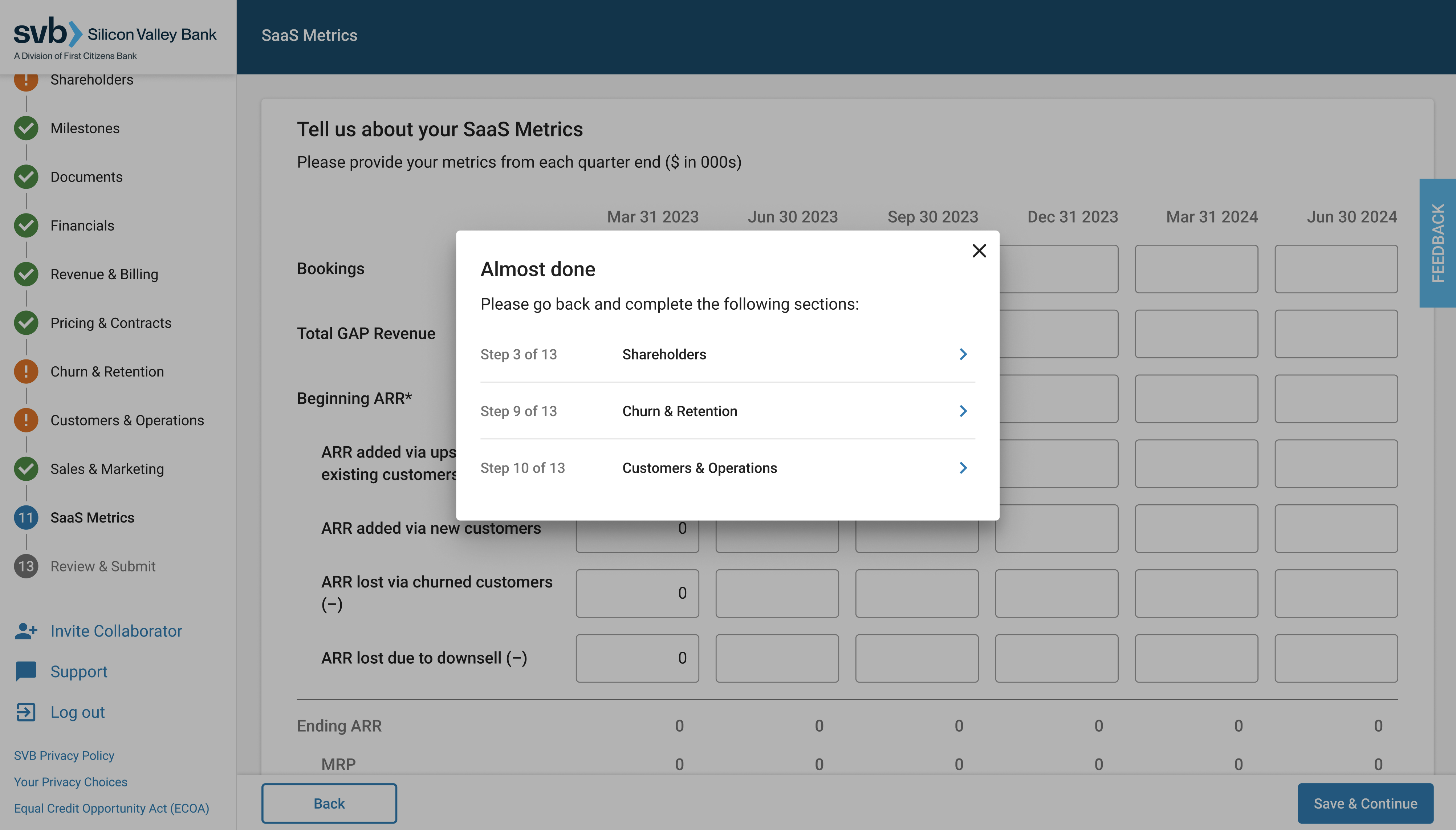
- Allow borrowers to navigate using the left stepper to proceed to subsequent steps even if they have incomplete required fields. If they attempt to proceed to the last step in the application with incomplete steps/fields, direct them accordingly:
Observation: Borrowers missing “Company legal name” despite it being the first field in the form.
Hypothesis: This one was confusing at first glance, but made sense upon analysis:
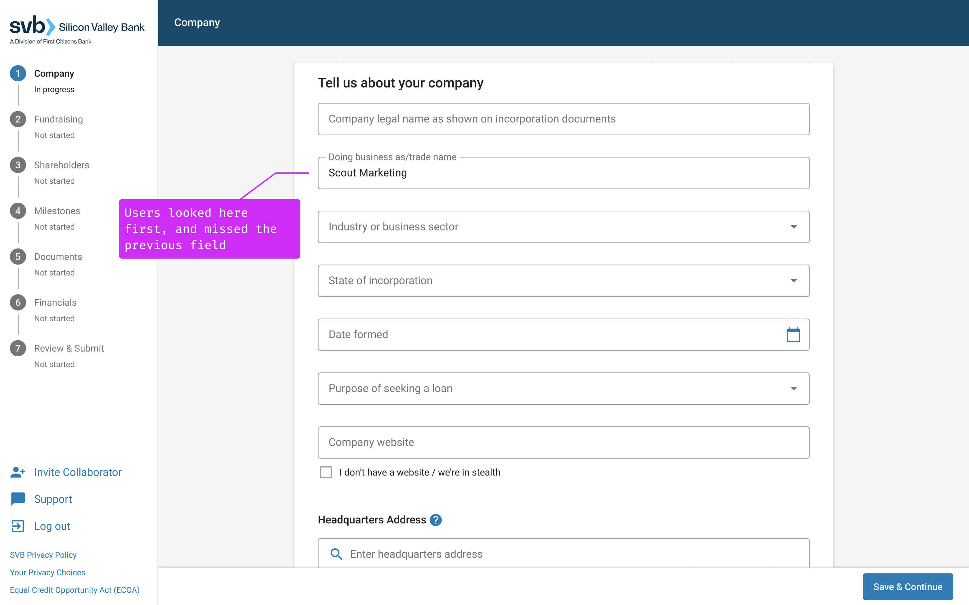
Recommendation: Simply swap the order of the first two questions so that “Doing business as” appears as the first field in the form.
Applicant experience: phase 2
Once a borrower has submitted their above loan application, signed their term sheet offer from the bank, phase 2 is all about the collection of legal diligence documentation — a more complex and error prone process.
My starting point to tackle this phase was to conduct interviews with six lenders to learn about their, and the borrower’s, pain points and map out the existing process into another Service Blueprint:
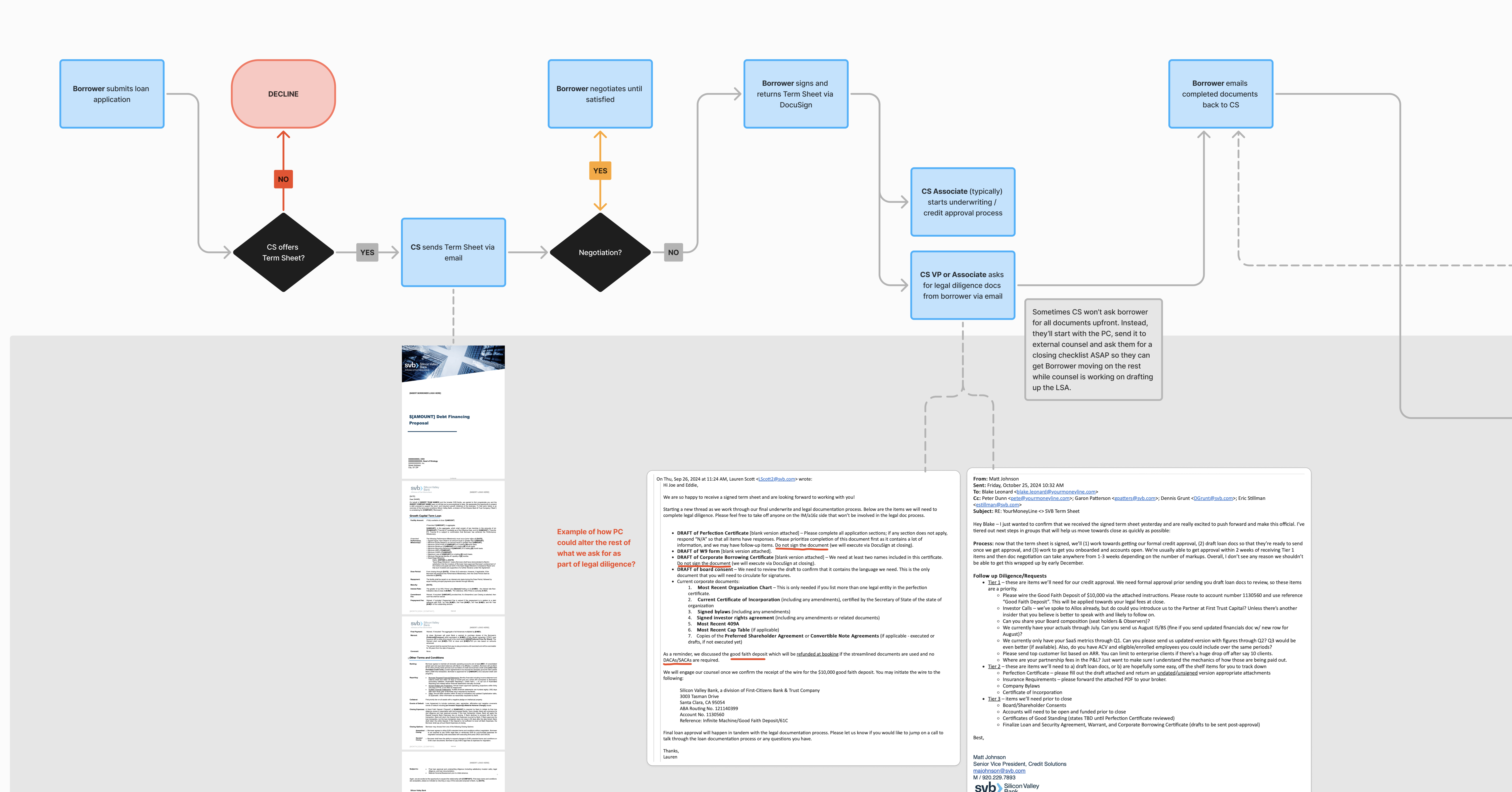
Takeaways that informed the design
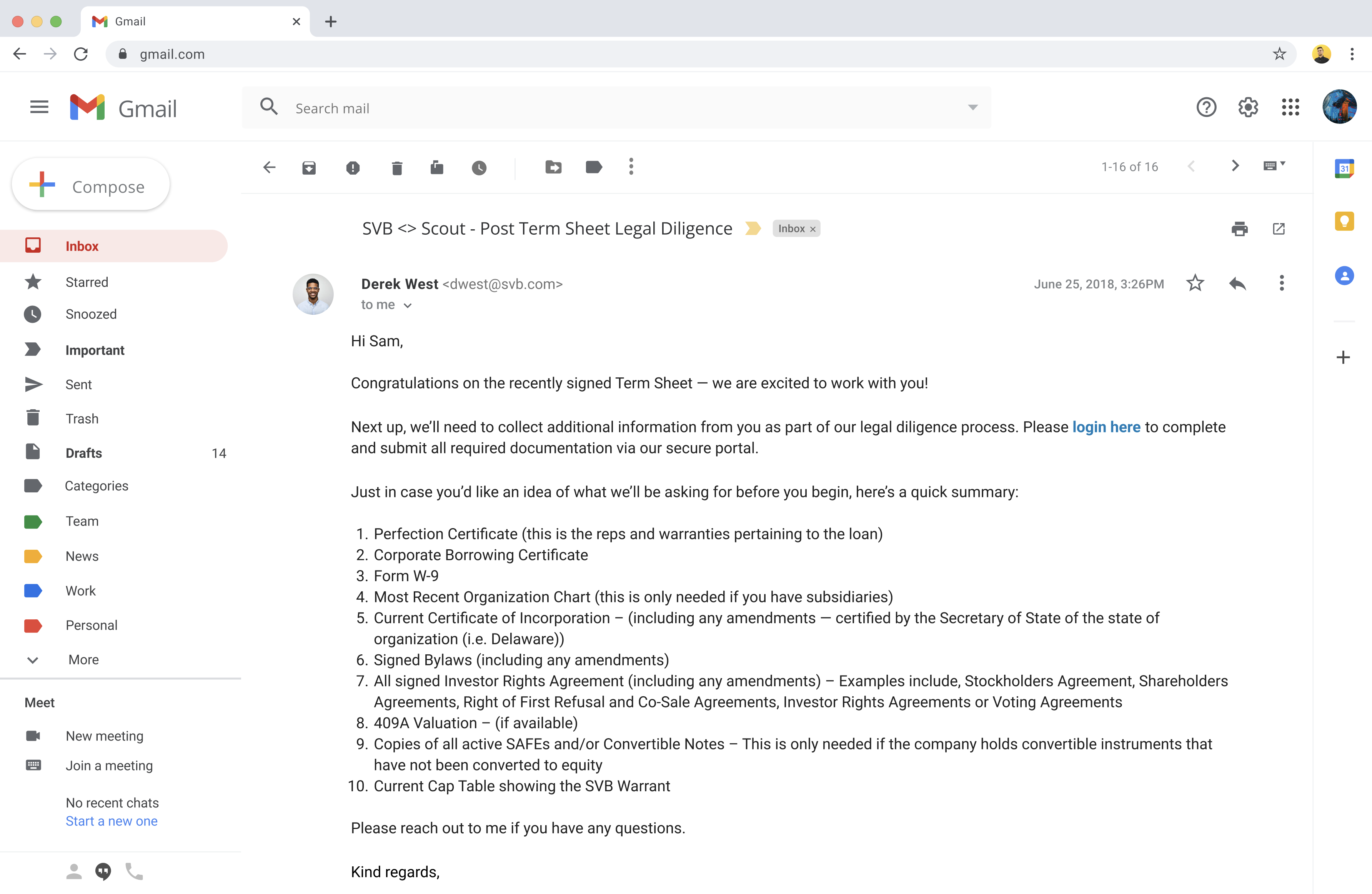
We learned that lenders wanted to preserve the step of manually reaching out to borrowers to congratulate them on signing their term sheet and kick off the legal diligence process. This was an important learning because, although the bank is trying to digitize experiences and automate processes, it doesn’t necessarily make sense in all scenarios (and is aligned with SVB’s relationship-driven strategy):
We learned that another significant source of friction was the sheer back and forth caused by using email to comment on offline Word documents. Whenever the legal counsel on either side of the deal redlined a document for negotiation or had a discussion item, it had to get relayed to the lender/borrower before making it to the opposing counsel:
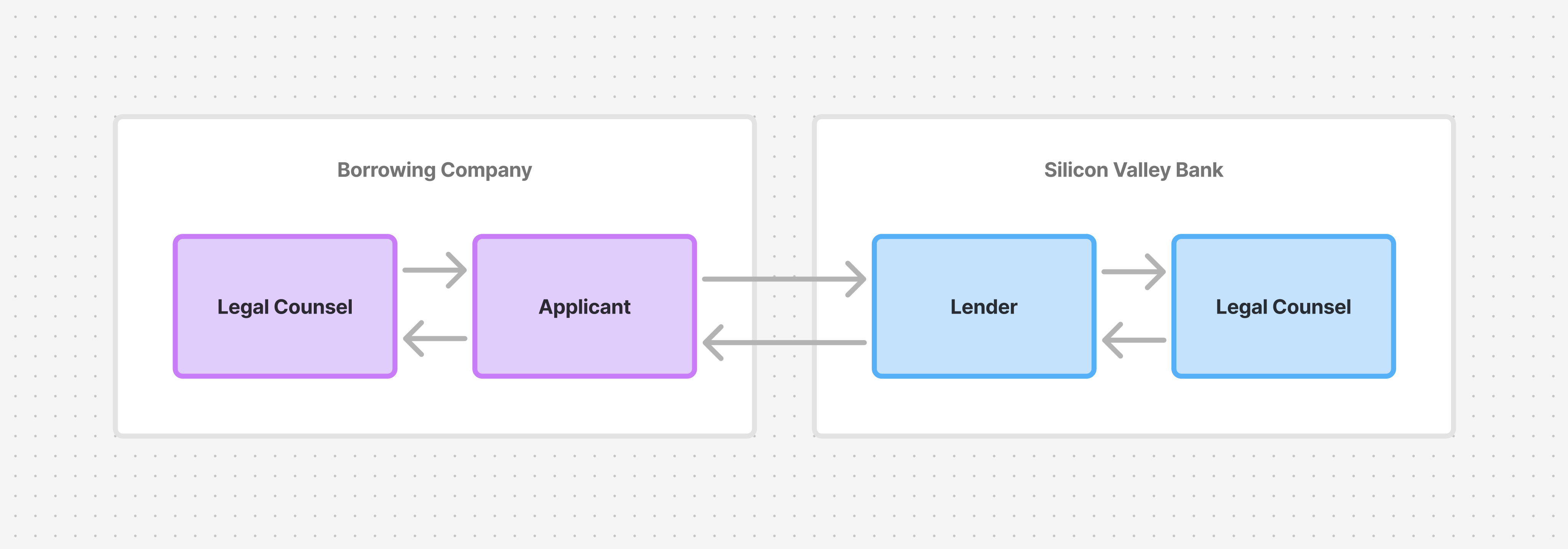
Connecting both counsels directly, or cc’ing everyone into a single email thread, seemed like the obvious solution, but lenders are encouraged to problem solve and field questions on their own, whenever possible, to avoid driving up legal fees.
Another obvious solution was to use real-time collaboration tools like MS Office or Google Workspace, but the bank doesn’t allow any documents to be shared this way due to our security policy. And replicating document collaboration functionality within our portal was simply out of scope for an MVP.
There was also no system between the bank and the outside law firm on the deal, and building one was out of scope. We emailed the lender the parts of the application they needed to forward, which is the handoff they already knew. Product and engineering were not confident a from-scratch build would land inside a 90-day deadline, so the flow used a vendor another team was already running for client onboarding.
We heard from lenders their concern of ensuring we don’t display anything in the UI that could give off the perception that the process will be faster than it actually is. So we orient the borrower by displaying subsequent steps, and set expectations at checkpoints:
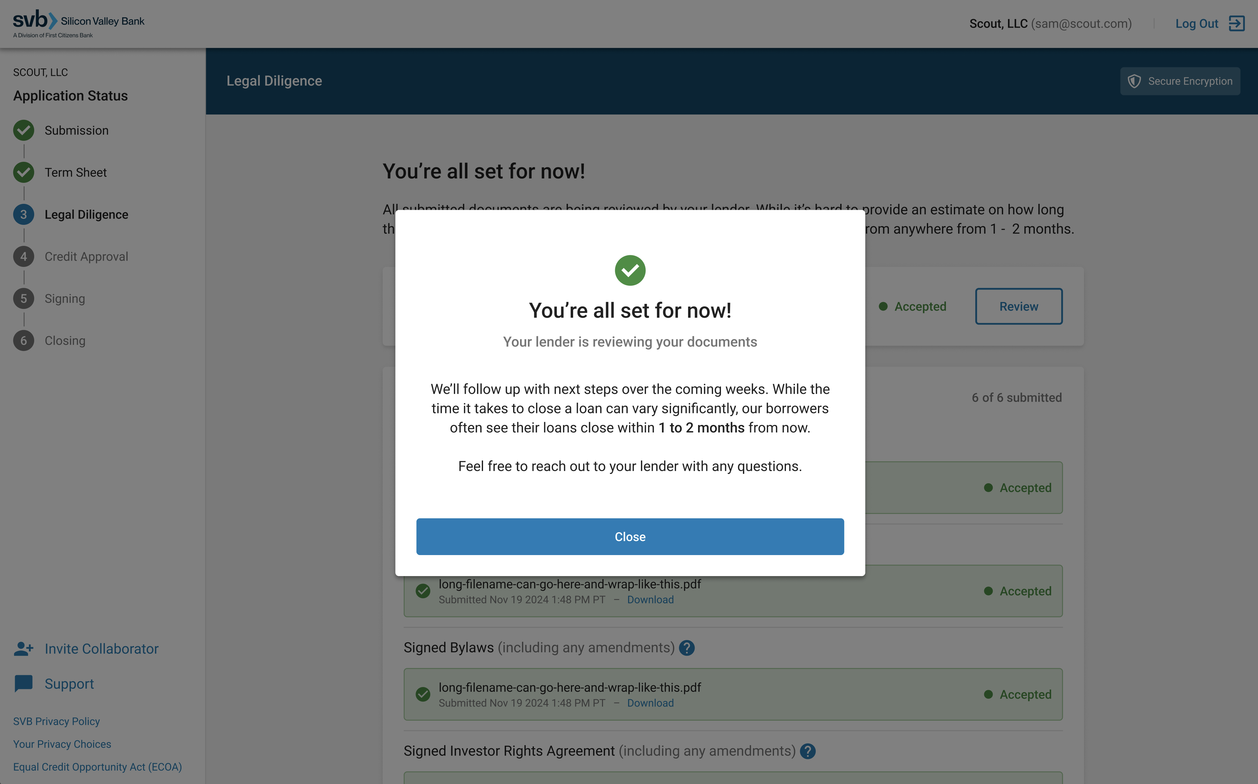
We learned that, depending on legal counsel’s review of the borrower’s application, additional documentation may need to be requested. As a result, we added a catch-all file upload section for the borrower to use in this scenario:
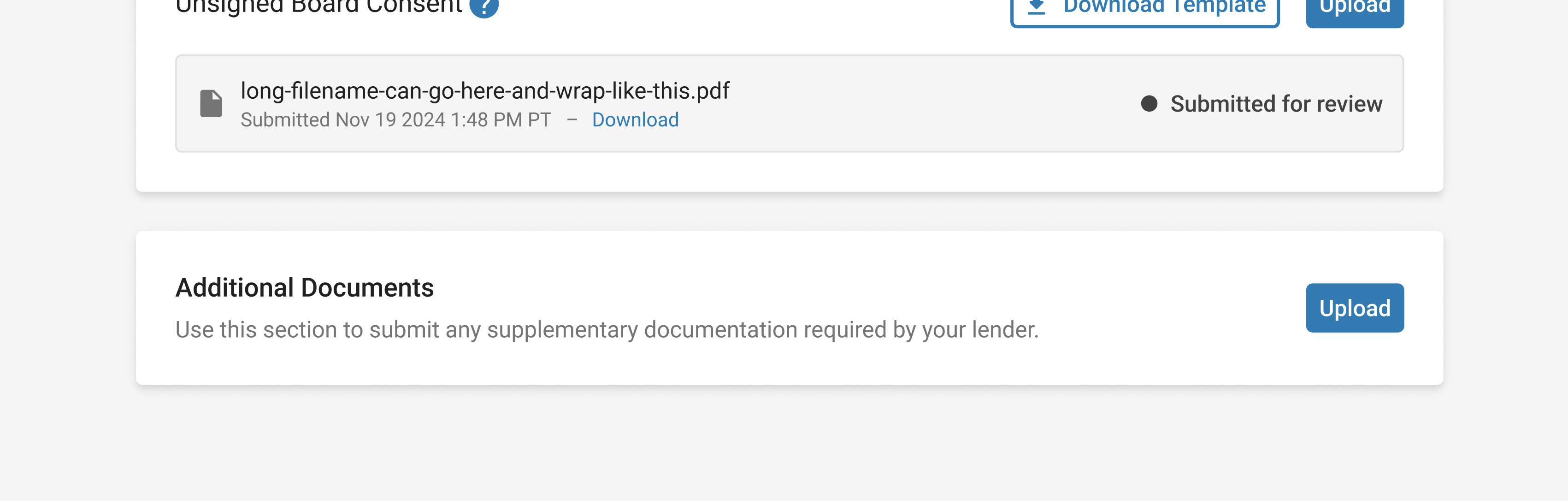
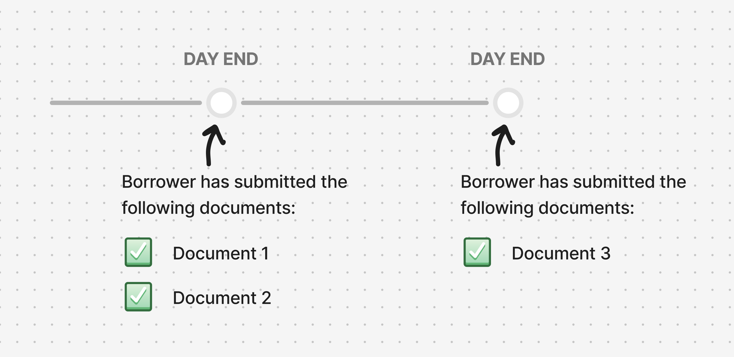
We learned that lenders were torn over when to be notified of borrowers submitting documents. They wanted to be notified as soon as possible so they could move the deal along sooner than later, but also didn’t want to be bombarded with emails.
Our solution was to send a single notification email, at the end of each day, containing all documents submitted by the borrower, if any. Lenders liked this because it capped the time delay to 1 day (which they were comfortable with), while also keeping emails to a minimum:
We discovered that the collection of insurance documentation was another significant point of friction. Lenders provided borrowers with detailed insurance requirements to pass along to their broker, whom would then issue documentation to the borrower, whom would then pass it along to their lender. However, brokers — especially those who never worked with SVB before — sometimes missed important details, resulting in more back and forth email delays. And with many borrowers being first-time founders, the idea of needing insurance in the first place was already unfamiliar. It even got to the point of lenders being able to anticipate how long the process would take by simply identifying the borrower’s insurance broker or not.
One partial solution that already existed was SVB’s partnership with the startup insurance provider, Vouch. Due to their close relationship, requirements were never missed because they became standardized in Vouch’s documentation, thus eliminating back and forth emails.
However, since it wasn’t practical to require all borrowers to use Vouch, and tackling this problem area was out of scope for an MVP, we kept it as something we would continue investigating in the near future.
Other decisions around visual design & content
We learned that all lenders request a standard list of legal diligence documents, but some ask for everything upfront, while others request them in chunks (depending on the nature of the deal and their subjective assessment of the borrower’s preference). Additionally, borrowers tend to complete and submit documents in a piece meal manner (these are company founders with very busy schedules). As a result, our solution needed to allow for return visits and the ability to submit documents one-by-one:
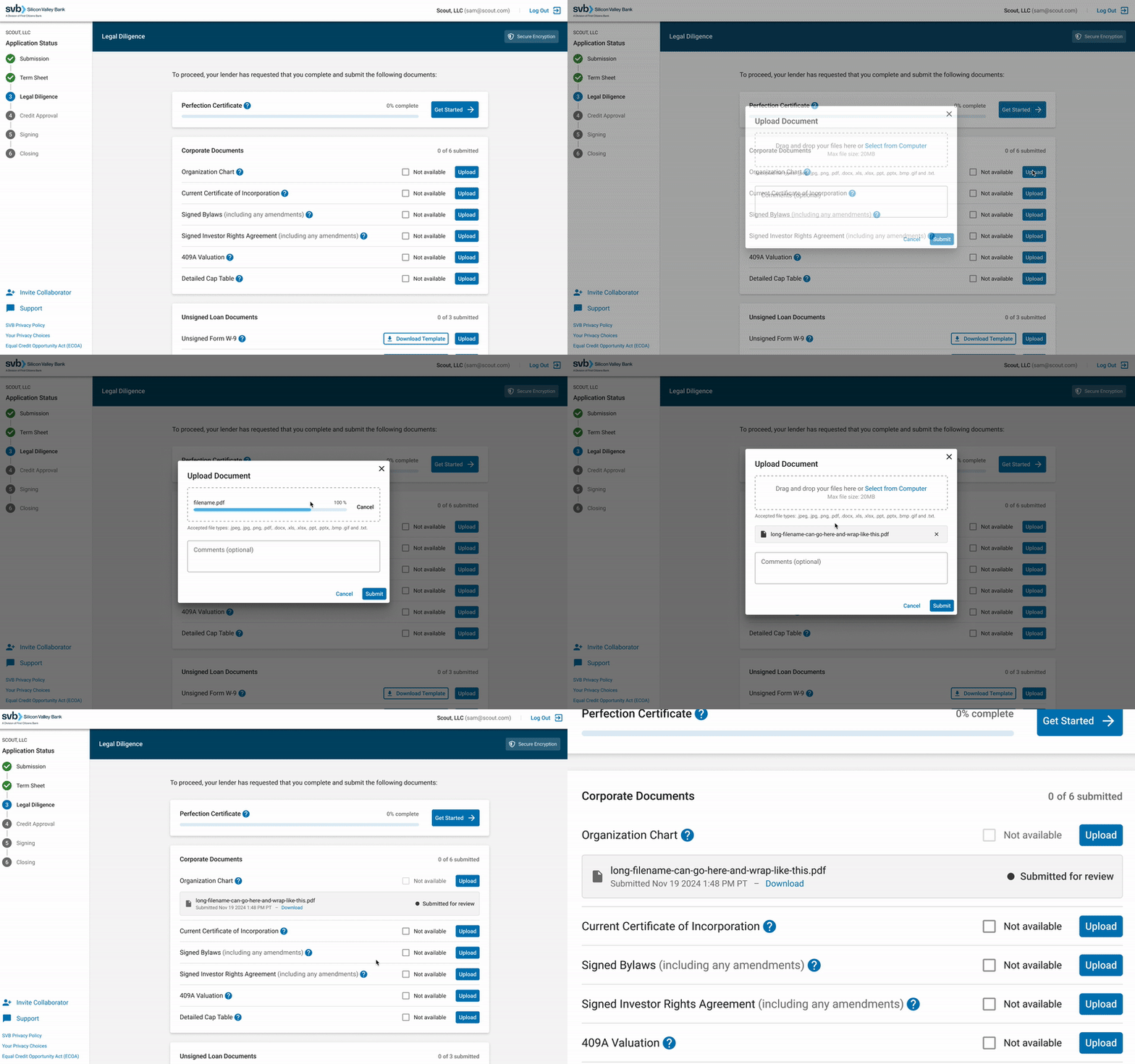
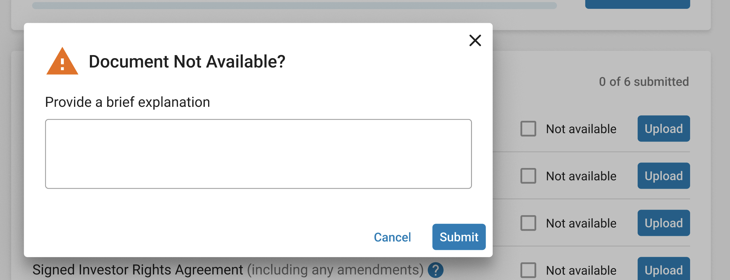
We learned that, on occasion, borrowers would omit a required document because they didn’t have it. But because they didn’t explicitly state that, their lender would have to reach back out to ask whether the omission was intentional or not. As a result, our form requires the borrower to indicate when a document is not available:
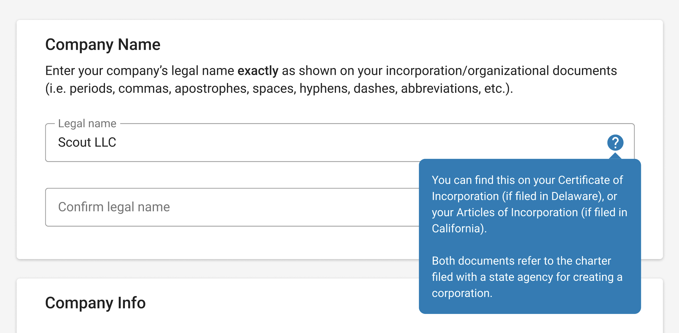
We learned that a complex legal document, known as a Perfection Certificate (originally completed via MS Word), resulted in simple errors that caused significant friction for borrowers, lenders, and legal counsels.
For example, the borrower must indicate their exact company legal name — however, sometimes they forget an apostrophe, capital letter, space, or the legal designation (eg. LLC, LLP, LTD). And since it’s a legally binding document, that level of precision is mandatory. As a result, we added clear instructions and require the borrower to type their company name twice for accuracy:
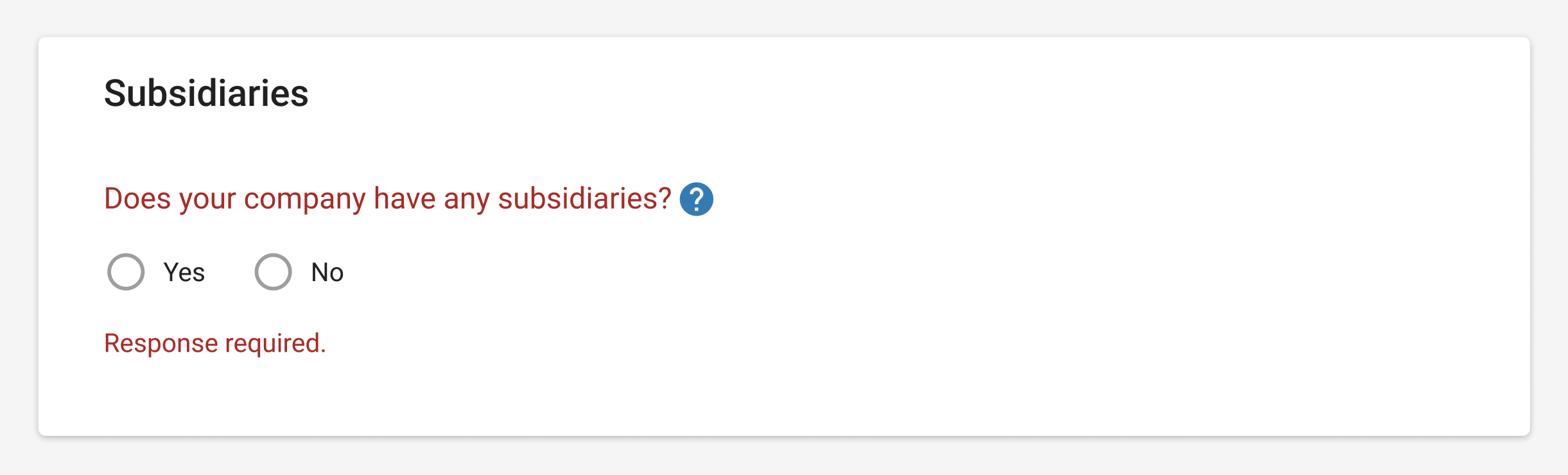
Another error occurred when borrowers left a question blank. Since the Perfection Certificate is a legally binding document, lawyers need the borrower to explicitly indicate whether a question does not apply by entering “N/A”. If it’s left blank, it isn’t clear whether it doesn’t apply, or the borrower simply missed it. We solved this with simple form validation rules to ensure borrowers could not proceed without providing a response to all questions:
To prevent the display of fields that don’t apply to the borrower, I worked with our lawyers to rephrase questions as yes/no, and introduced conditional logic:
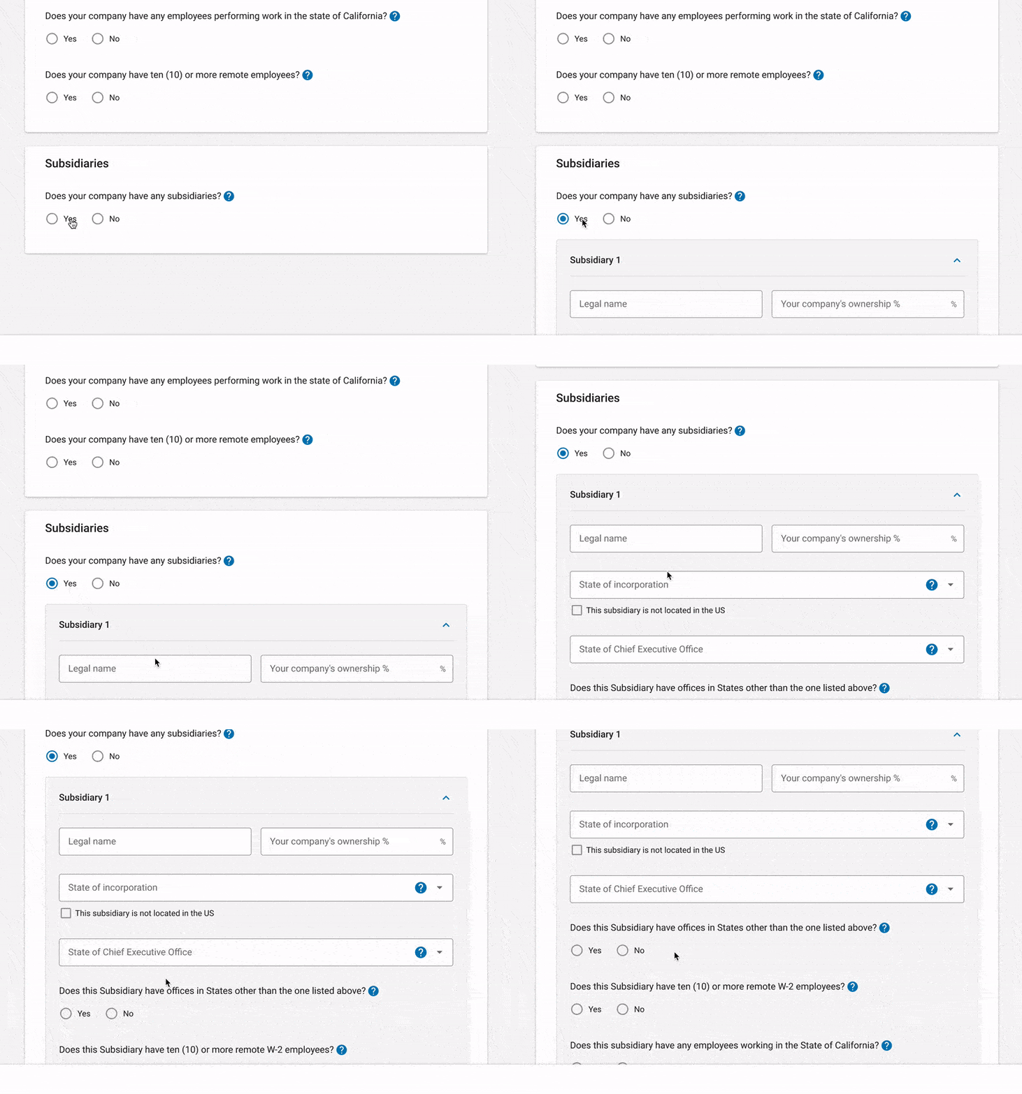
View original question phrasing
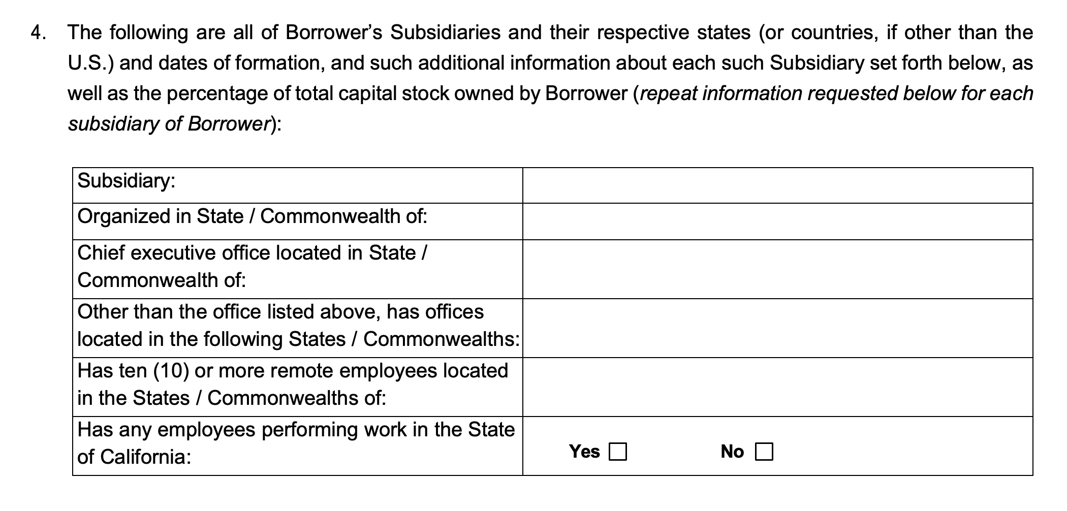
We learned that fractional CFOs may be the ones completing and submitting legal diligence on behalf of multiple companies applying for debt at SVB. As a result, we display the name of the company, and the user’s email, as confirmation that they’re in the right place (Usability Heuristic: “Recognition rather than recall”):

Future state ideas & reflections
- With the likes of Stripe Capital, Shopify Capital, Quickbooks Capital, etc. all leveraging customer data to proactively offer loans to their commercial clients, how might SVB leverage client transaction data to do the same? This would completely eliminate the need for borrowers to fill out an application in the first place.
- Our loan application collects a lot of the same information that borrowers provide to their investors. Leveraging our strong relationships with VC firms, what if we built an integration with their onboarding systems that allowed companies to click a button and pass along the same information to SVB to start an initial application for debt? After a capital raise, VCs often send business to SVB by recommending their portfolio companies to apply for our venture debt offering anyway.
So that covers the full loan application experience, the other project I worked on was the online banking experience once the borrower receives their loan.
Loan servicing experience
With the bank’s decision to invest in digital transformation, came the creation of a completely revamped online banking experience built in-house from scratch (known as SVB Go). Since it wasn’t practical to have all parts of the platform completed at the same time, we gradually migrated clients from our legacy banking platform as modules and features got completed. In Q1 of 2022 I joined a new team purely focused on building the client-facing loan servicing experience (i.e. everything related to using and managing one’s loan), where I was the sole designer.
Discovery insights
At the time, the inner workings of loans was new to me, so my starting point was to study SVB’s loan product offering and our legacy banking platform, speak to subject matter experts, and read legal documentation. Some of the highlights from my discovery effort:
- SVB’s loan products are highly customizable to meet the unique needs of startups operating in the innovation economy, resulting in complexity and a lack of standardization. To provide a glimpse into the complexity, below is just one example of a debt product where a single borrower, with two company entities, has a debt facility containing two tranches, each with different controls/configurations, one of which contains both a line of credit and a term loan, which the borrower can draw down on (i.e. request advances). This isn’t even the most complex scenario either.
- Our legacy banking platform experience (known as eConnect) was outdated, lacked key details, was designed by developers back when the bank didn’t have a design team, and did not always accurately reflect the complexity of our loan products.
- The terminology used amongst clients, internally amongst teams, and in our legal documents, were not always aligned, making conversation and knowledge transfer inefficient because it was never obvious what someone was referring to without clarification.
- Our legacy backend loan accounting system limits what we can display to clients and is complicated to navigate. Furthermore, there are very few SMEs with deep knowledge of the system, which resulted in a slow learning curve for our team and long delays whenever we had questions.
- To appreciate the above complexity, and the friction it caused not only for clients but also internally amongst teams, here’s an example of a straightforward term loan at the bank and some of the friction around it:
- Internally, each tranche was referred to as an “Advance”, “Loan”, or “Note” — partially because the former two are used in our legal documentation, and partially because the latter is what our backend loan accounting system uses (which is not editable because it’s provided by a third party vendor). The reason a tranche is referred to as an “Advance” or “Loan” in our legal documents is because the tranche gets advanced (formal term for disbursement) to the borrower, is booked in our loan accounting system as a note, and gets displayed as a loan in the client-facing UI. And the reason it displays as a loan in the UI, despite being a tranche, is because there is no concept of an overarching facility with tranches being used in eConnect (more on this later). In short, we were trying to display complex, multilayered loan products in a UI that was only designed to accommodate simple loans without layered structures — thus limiting what we could display to the client.
Because of the above, I found myself taking lots of notes and visual diagrams in FigJam — not only to maximize my own comprehension — but as a visual aide to make collaboration more efficient (a practice I’ve been praised for and have found to be a very effective communication method in general).
Initial design
Since speaking to clients was not an option at the time, I had to go off assumptions and hypotheses for the initial designs. Design decision highlights:
💡 Tactic reflection
With the bank’s focus on digital transformation via the digitization of experiences and automation of processes, it only made sense that one goal of our new online banking platform was to reduce the need for clients to reach out to their relationship manager for basic informational questions. One way of achieving this is by designing a self-service experience that allows clients to conveniently answer their own questions. Thus, it only made sense to try and maximize the amount of useful information we make accessible in the UI, without overwhelming the client or making it difficult to find.Key questions I hypothesized the client would have:
- Do I have enough money to cover a current or future business need? Or, in other words, how much of my loan is currently available for me to use right now?
- Do I have enough money to ensure I remain in compliance with the terms of my loan agreement? Or, in other words, how much do I currently owe in total, when is my next loan payment due and for how much?
- Where can I find various details regarding my loan? (e.g. dates, interest rates, covenants, time frames, calculations, amortization, etc.)
Key actions borrowers would need the ability to take:
- Request an advance
- Make a payment
- View statements
As touched on earlier, there was no concept of an overarching facility being used in eConnect. With the team who originally built the loan experience in eConnect no longer at the bank, I assumed it was due to their attempt to mirror the backend architecture in the UI, which focused on individual loans as opposed to the overarching facilities they made up, thus leaving clients without a higher-level view and data points.
- Taking into account that our lenders and legal documents (both client facing) thought of, and portrayed, our loans in the context of an overarching facility, I hypothesized that our clients’ mental model was also the same:
- As a result, I reflected this in the new design. Instead of clients seeing a list of individual loans, they would see a list of facilities, each containing their respective tranches.
- This enabled the display of aggregate data points like Total Credit Limit, Total Outstanding Balance, and the separation of “Committed” versus “Flex” portions for entire debt facilities (to avoid going down the rabbit hole, just think of them as chunks of money within the overall facility that have different controls/rules/covenants governing them). All of this information was detailed in the loan agreements signed by borrowers, so I felt fairly confident that they’d prefer to see it in the UI instead of having to dig up and scroll through a long PDF. I just wasn’t sure which data points to give more/less prominence to — a topic we eventually had the opportunity to ask clients about that I’ll cover later.
Introduced a facility detail page so that clients can find all relevant information in one place. Due to the complex and limiting nature of our legacy backend system (and lack of SMEs), it was difficult to get definitive answers on what data points were even available for us to display in the UI (beyond what was already being displayed in eConnect) — as a result, I designed the detail page to leverage a modular architecture to accommodate broad product configurations and avoid significant rework effort if we later found out that our backend system could, or could not, display a certain data point.
- Something I’ve learned working in a large bank is just how long it can take to build things (bureaucracy, legal constraints, regulatory constraints, legacy systems, a web of third party vendors, etc.). Barring significant organization wide operational improvements, I’ve found that incorporating flexibility into my designs to be an important tactic for the reason outlined above.
Multi card layout to keep components of the client’s loan organized in a logical manner (i.e. overview at the top followed by sections for each tranche making up their loan). Each card would start with 2-4 child containers to display the most frequently referenced information, followed by an optional “More Details” accordion to accommodate additional data points that clients may need infrequently. And since each tranche typically comes with its own set of controls/rules/covenants, they would use this same card architecture as well.
Buttons for the most frequent actions a client takes related to their facility. Since a facility’s purpose is to be used to run their business, a button to request advances from their facility made sense. A button to view statements was also added primarily because it was an existing pattern already being applied elsewhere on the platform. With user research not being an option at the time, it left me curious about client preferences around statements. Did they prefer to view all statements, across all their banking products, in a single place? Or did they prefer to view them in-context? (e.g. a “Statements” tab within the facility detail page).
Introduced tabs to make the discovery of loan information easier for the client — instead of requiring them to scroll through a single long page, which was a pattern already being applied elsewhere on the platform.
Introduced a data visualization component to maximize the communication of key information while using the least amount of page real estate. Specifically, a donut chart with segments to represent how much of each tranche they’ve used. Color coding to indicate the status of funds.
Hypothesized on the most important pieces of information to the client:
- Total Amount Available
- Outstanding Balance
Emphasizing the amount of money currently available to the borrower at any given moment. At the end of the day, clients use their loan to run their business. I assumed that knowing how much of their loan they had available to use was important.
Tooltips peppered throughout the UI to provide added context where clients have typically had questions, and reduce the likelihood of clients needing to dig and read the fine print on their multi page loan agreement.
Introduced an indicator for when a tranche is setup for auto debit — often a requirement to get a loan with SVB. A similar pattern was also being applied to the credit card payment experience elsewhere on the platform.
—
User interview takeaways that informed the design
Before starting development, and in partnership with our UX researcher (Joy Dong), we got the opportunity to interview 10 existing loan clients to learn about their historical experience with eConnect and get feedback on my designs.
- We learned that clients were frustrated by eConnect not having a consolidated view at the facility level, validating our hypothesis. Clients found themselves either having to dig up and read their legal agreements, or reaching out to their RM with simple questions. Some even went as far as creating their own spreadsheet to manually calculate, and manually update, balances related to their facility. They were more than happy to share their spreadsheet with us so we could use it as a reference for designing the new experience (this was particularly helpful in determining high versus low priority data points to emphasize in the UI).
- We learned that while clients generally wanted to see more data about their facility, they specifically prioritized Total Available Funds, Outstanding Principal, Interest Info, and Amount Due — both at the entire facility level, and at the individual tranche level, where applicable. As a result, this info made it into the child sections at the top of each card for emphasis and quick discovery.
- On the topic of interest info, we learned that clients wanted to see as much info as possible (i.e. interest rate, interest rate breakdown, how their rate has changed over time, historical and future interest payments, right down to the calculation of any data point related to interest). The reason they wanted this level of granularity was so that they could provide full transparency to their investors about their debt situation (i.e. to be able to prove their debt status is in good health).
- In short, we learned that clients’ understanding, and the terminology they used, mirrored our legal agreements. This made sense, as it was the source of truth for all information related to their facility.
- We learned that interest rate information was even more important than we anticipated, which was also lacking on eConnect. Simply seeing their interest rate was not enough. They wanted a breakdown of their rate (e.g. Prime rate + Spread), history of how their rate has changed over time, calculations of interest amounts with clear separation of principal versus interest, as well as the ability to see how much they’ll owe in interest at a future date. Upon digging into it, the primary reason they wanted this level of granularity was for financial reporting to their investors. In other words, they needed the ability to provide clear evidence of their debt health to maintain a healthy relationship with their investors.
- Clients wanted an easier way to request advances, which was a clunky process requiring them to complete a lengthy PDF form.
- Clients wanted more flexibility around making loan payments. Specifically, the ability to schedule future-dated payments so they could do a bunch in a single session and not have to wait until a specific date to initiate it manually.
- Clients wanted their loan agreement to be accessible from within the portal instead of having to search for it in their files whenever they needed to look something up (e.g. the milestone(s) they had to hit in order to unlock subsequent tranches).
- When making a loan payment, clients wanted the option to designate part of it to go towards principal versus interest. Since auto debit was a requirement for the vast majority of clients, the form to submit a loan payment would primarily be used for making additional payments towards principal or interest.
Because balances displayed in eConnect were not accurate 100% of the time, some clients went as far as creating their own spreadsheet to calculate key balances on their own.
What I learned
Most of what I took from SVB was how to design under strict constraints, which is the nature of a large regulated bank. Vendors made anything off the default path expensive. Security, compliance, and legal review sat between a decision and a launch. The design system and the backend were already there, and the backend did not always have the concept the client was asking to see. A highly polished interface built from scratch was rarely the move. The leverage was in the sequence: ask for less, show the next step, let someone leave and come back, and reuse a component that had already been approved.
Just as important was bringing people along. At the bank, nothing shipped until the people who had to live with it were on the same page and had signed off. Lenders, relationship managers, legal, architecture, and engineering were all in that group, and they did not start with the same words for the loan. Service blueprints and workshops were how we got buy-in. The blueprint gave the room one journey to react to. The workshop was where that journey turned into a scope. I treated the agenda as scaffolding: enough to get everyone started, and something to set down when the discussion was more useful than the plan.
The thing I made for those rooms was a storyboard in Figma, built like an interactive deck. Slides, diagrams, and a prototype of the product, in one file people could click through. I used it to present the narrative, get feedback, and leave with a decision. It became a skill my colleagues valued. It is also what seeded the service design tool I’m working on now.